Introduction
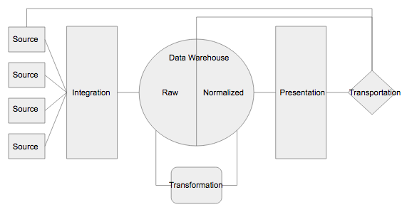
Arabica is a python library for exploratory text data analysis focusing on text from a time-series perspective. It reflects the empirical reality that many text datasets are collected as repeated observations over time. Time series text data include newspaper article headlines, research article abstracts and metadata, product reviews, social network communication, and many others. Arabica __ simplifies exploratory analysis (EDA) of these datasets by providing these methods:
- arabica_freq: descriptive n-gram analysis and time-series n-gram analysis, for n-gram based EDA of text dataset
- cappuccino: for visual exploration of the data.
This article provides an introduction to Cappuccino, Arabica’s visualization module **** for exploratory analysis of time-series text data. Read the documentation and a tutorial here for a general introduction to Arabica.
EDIT Jan 2023: Arabica has been updated. Check the documentation for the full list of parameters.
2. Cappuccino, visualization for exploratory text data analysis
The plots implemented are word cloud (unigram, bigram, and trigram versions), heatmap, and line plot. They help discover (1) the most frequent n-grams for the whole data reflecting its time-series character (word clouds) and (2) n-grams development over time (heatmap, line plot).
The graphs are designed for use in presentations, reports, and empirical studies. They are, therefore, in high resolution (pixels depend on the data range displayed in the graphs).
Cappuccino relies on matplotlib, worcloud, and plotnine to create and display graphs, and cleantext and NTLK corpus of stopwords for pre-processing. Plotnine implements the popular and widely used ggplot2 library into Python. The requirements are here.
The method’s parameters are:
def cappuccino(text: str,                # Text
               time: str,                # Time
               plot: str = '',           # Chart type: 'wordcloud'/'heatmap'/'line'
               ngram: int = '',          # N-gram size, 1 = unigram, 2 = bigram, 3 = trigram
               time_freq: str= '',       # Aggregation period: 'Y'/'M'', if no aggregation: 'ungroup'
               max_words int = '',       # Max number for most frequent n-grams displayed for each period
               stopwords: [],            # Languages for stop words
               skip: [ ],                # Remove additional strings
               numbers: bool = False,    # Remove numbers
               punct: bool = False,      # Remove punctuation
               lower_case: bool = False  # Lowercase text
)
3. Descriptive n-gram visualization
Descriptive analysis in Arabica provides n-gram frequency calculations without aggregation over a specific period. In simple terms, first, n-grams frequencies are calculated for each text record, second, the frequencies are summed for the whole dataset, and finally, the frequencies are visualized in a plot.
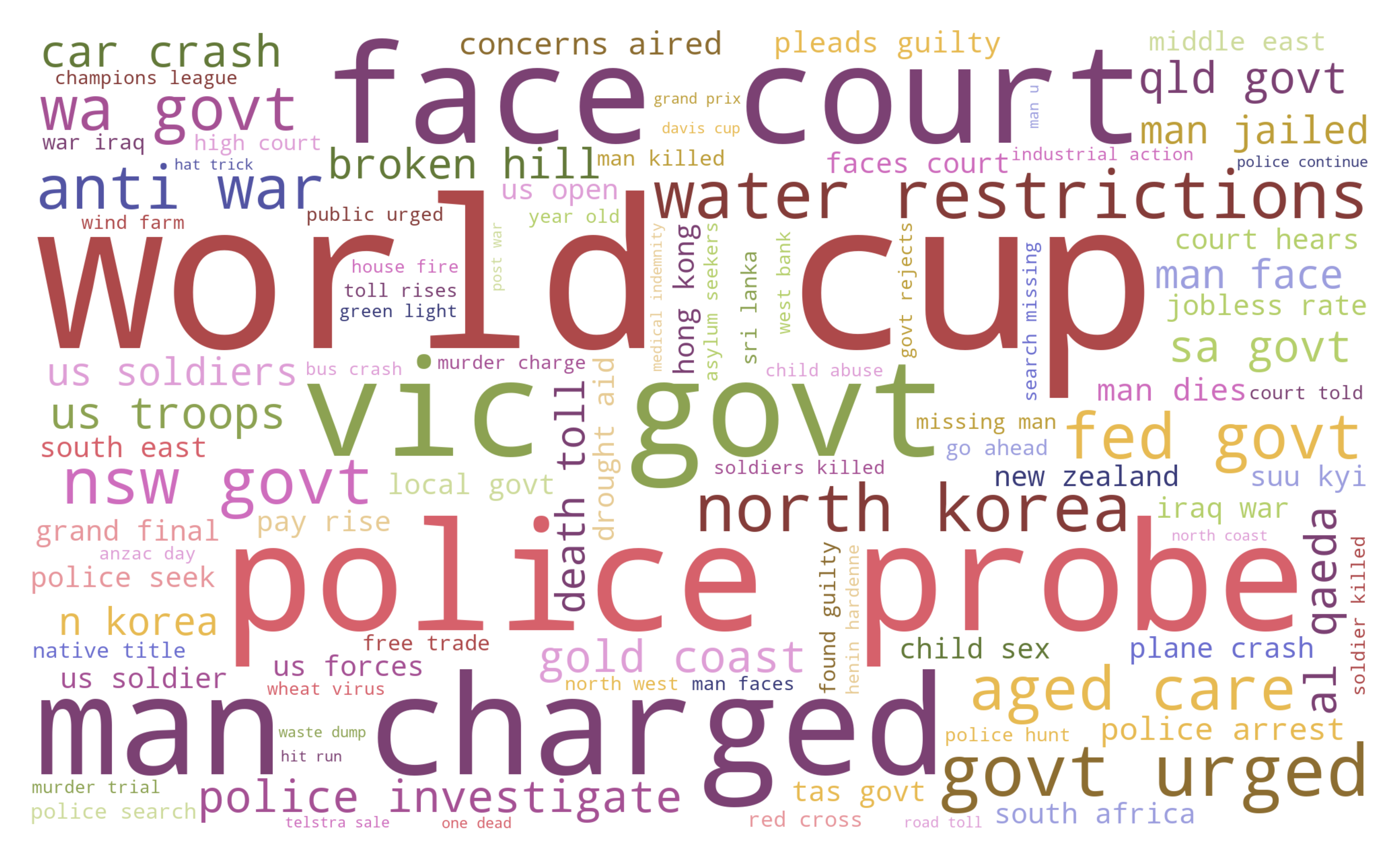
Word cloud
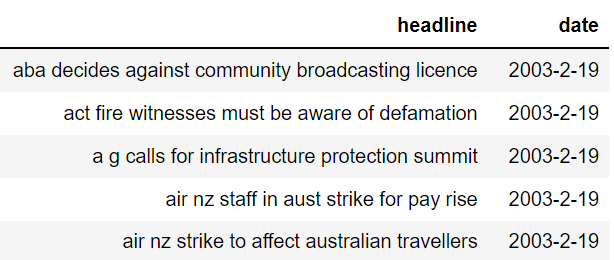
Let’s illustrate the coding on the Million News Headlines of news headlines published in daily frequency over 2003–2–19: 2016–09–18. The dataset is provided by the Australian Broadcasting Corporation under the CC0: Public Domain license. We’ll subset the data to the first 50 000 headlines.
First, install Arabica with pip install arabica, then import Cappuccino:
from arabica import cappuccinoAfter reading the data with pandas, the data looks like this:
We lowercase the text, clean the data from punctuation and numbers, remove English stopwords and other unwanted strings ("g", "br"), and plot a word cloud with the 100 most frequent words:
cappuccino(text = data['headline'],
           time = data['date'],
           plot = 'wordcloud',
           ngram = 1,               # n-gram size, 1 = unigram, 2 = bigram, 3 = trigram
           time_freq = 'ungroup',   # no period aggregation
           max_words = 100,         # displays 100 most frequent words
           stopwords = ['english'], # remove English stopwords
           skip = ['g','br'],       # remove additional strings
           numbers = True,          # remove numbers
           punct = True,            # remove punctuation
           lower_case = True        # lowercase text
)
It returns the word cloud:
After changing ngram = 2 , we receive a word cloud with the 100 most frequent bigrams (see the cover picture). Alternatively, ngram = 3 displays the most frequent trigrams:
4. Time-series n-gram visualization
Time series text data typically display variability over time. Political statements before elections and newspaper headlines during the Covid-19 pandemic are nice examples. To display the n-grams over time, Arabica implements a heatmap and a line plot for monthly and yearly periods.
Heatmap
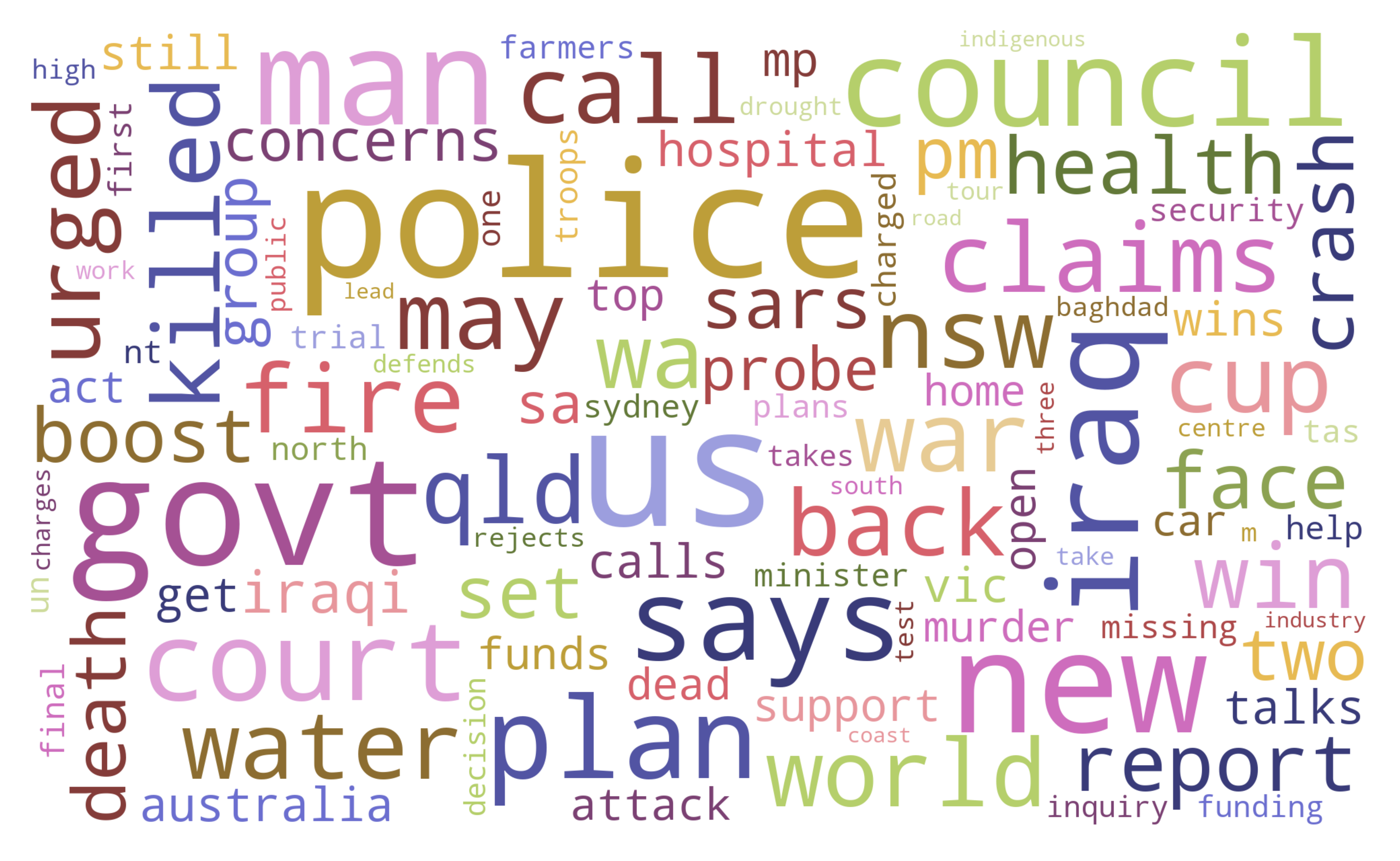
A heatmap with the ten most frequent words in each month is displayed with the following code :
cappuccino(text = data['headline'],
           time = data['date'],
           plot = 'heatmap',
           ngram = 1,               # n-gram size, 1 = unigram, 2 = bigram
           time_freq = 'M',         # monthly aggregation
           max_words = 10,          # displays 10 most frequent words for each period
           stopwords = ['english'], # remove English stopwords
           skip = ['g', 'br'],      # remove additional strings
           numbers = True,          # remove numbers
           punct = True,            # remove punctuation
           lower_case = True        # lowercase text
)
The unigram heatmap is the output:
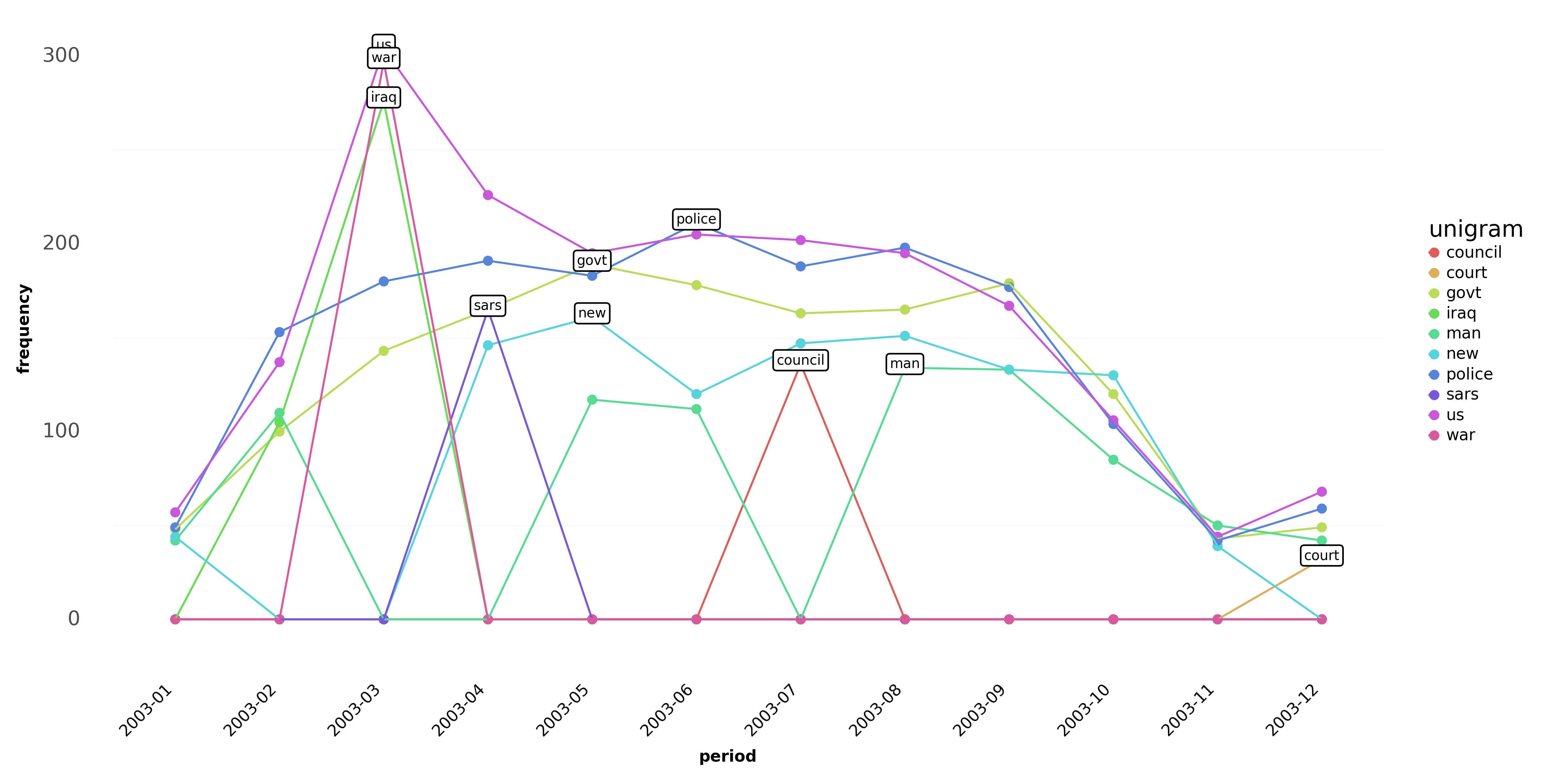
The unigram heatmap gives us the first look at the variability of data over time. We can clearly identify the important patterns in the data:
most frequent n-grams: "us", "police", "new", "man".
outliers (terms appearing only in one period): "war", "wa", "rain", "killed", "iraqi", "concerns", "budget", "bali".
We might consider removing the outliers in the later stage of the analysis. Alternatively, we create a bigram heatmap by changing ngram = 2 and max_words = 5 displaying a heatmap with the five most frequent bigrams in each period.
Line plot
A line plot with n-grams is displayed by changing plot = 'line'. By setting ngram parameter to 1 and max_words = 5 we create a line plot for the five most frequent words in each period:
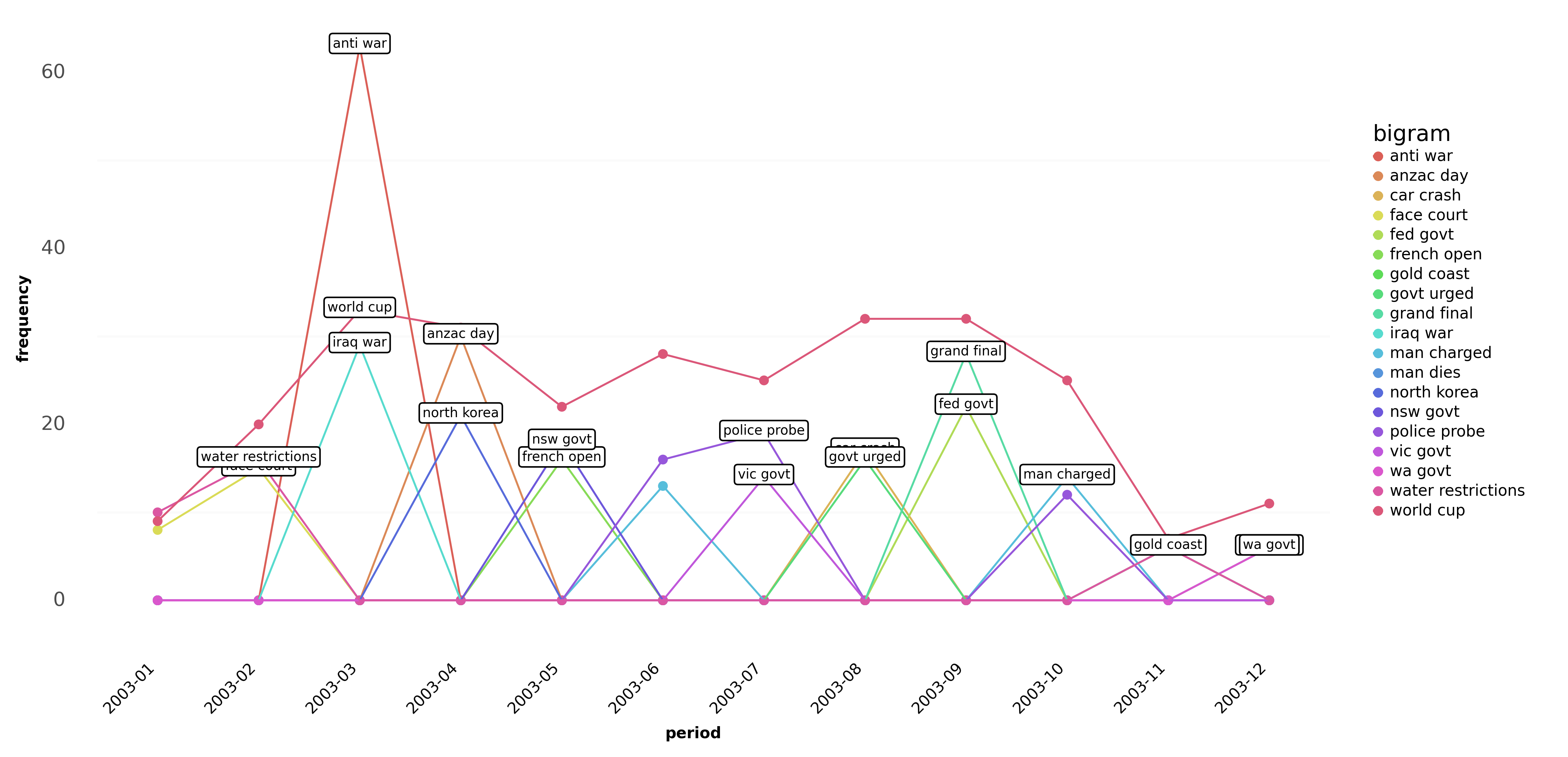
Similarly by changing ngram = 2 and max_words = 3 the bigram line plot looks like this:
Final remarks
Cappuccino greatly helps in the visual exploration of text data which has a time-series character. With a single line of code, we pre-process the data and provide the first exploratory glimpse of the dataset. Here are several tips to follow:
- The visualization frequency also depends on the length of the time dimension in the data. In long time series, a monthly plot will not display the data clearly, while a graph for short time series (less than a year) in yearly frequency will not provide any variability over time.
- Select a suitable form of visualization on the basis of the dataset in your project. A line plot is not a good choice for datasets with high n-gram variability over time (see Fig 8). In this case, the heatmap shows a better picture even for many n-grams in each period.
Some questions we can answer with Arabica are (1) how the concepts in a specific domain (economics, biology, etc.) evolved over time, using research article metadata, (2) which key topics were emphasized during a presidential campaign, using Twitter tweets, (3) which parts of the brand and communication a company should improve, using customer product reviews.
The complete code in this tutorial is on my GitHub. For more examples, read the documentation and a tutorial on _arabicafreq method.
EDIT: Arabica now has a sentiment and structural breaks analytical module. Read more and also check practical applications in these tutorials:
- Sentiment Analysis and Structural Breaks in Time-Series Text Data
- Customer Satisfaction Measurement with N-gram and Sentiment Analysis
- Research Article Meta-data Description Made Quick and Easy
Did you like the article? You can invite me for coffee and support my writing. You can also subscribe to my email list to get notified about my new articles. Thanks!