-

5 Crucial Tweaks That Will Make Your Charts Accessible to People with Visual Impairments
Data VisualizationMore than 350 million people are colorblind – Make sure they can read your visualizations.
13 min read -

Local Large Language Models can convert massive DataFrames to presentable Markdown reports — here’s how.
11 min read -
Spoiler: It’s harder than you think.
8 min read -

The best part? You’ll only have to do this once.
6 min read -
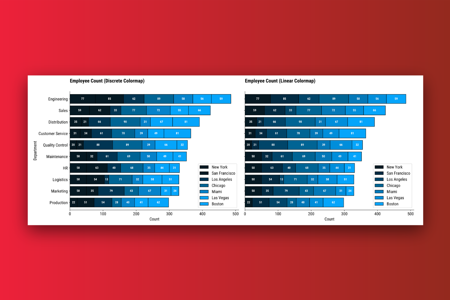
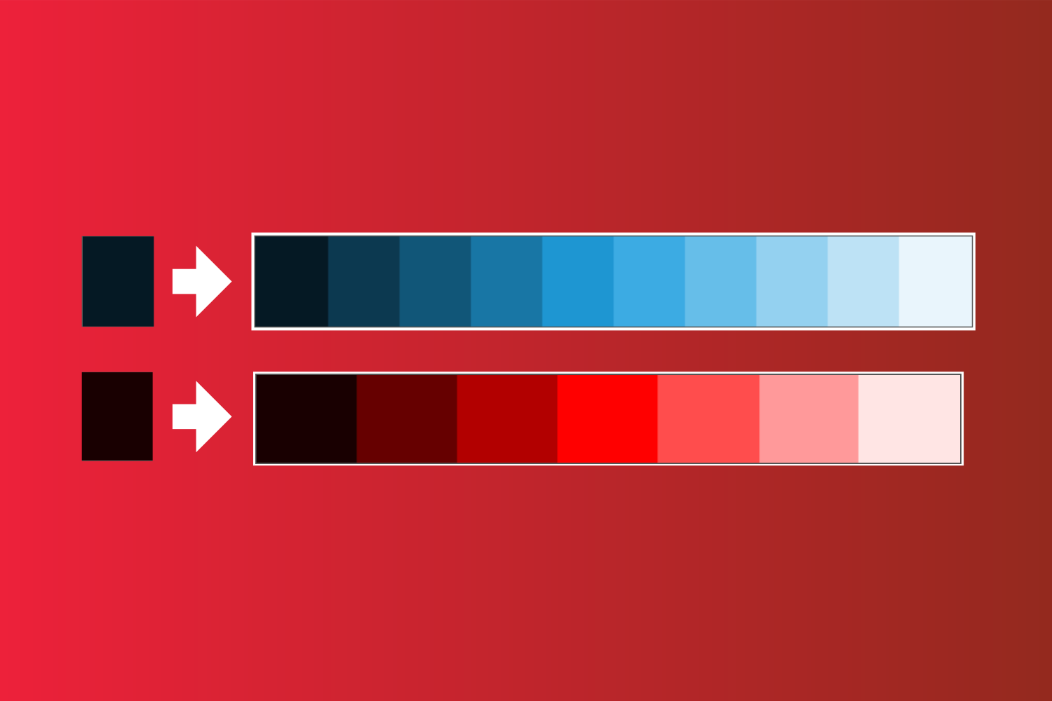
How to Create Custom Color Palettes in Matplotlib – Discrete vs. Linear Colormaps, Explained
Data ScienceActionable guide on how to bring custom colors to personalize your charts
6 min read -

Matplotlib charts are an eyesore by default – here’s what to do about it.
4 min read -

Which features carry the most weight? How do original features contribute to principal components? These…
8 min read -

Poetry makes deploying machine learning applications a breeze – learn how!
8 min read -

Moving data around can be slow. Here’s how you can squeeze every bit of performance…
9 min read -

The one billion row challenge is exploding in popularity. How well does Python stack up?
10 min read